Most dashboards fail when visuals are cluttered, metrics are unclear, or users cannot act. We design visual analytics that make decisions faster.


Every dashboard, report, and executive view should help someone make a better decision. If visuals are crowded, metrics lack context, or users cannot find the signal, data becomes another source of confusion.
DataTheta’s Data Visualization service turns trusted data into clear dashboards, narratives, and interactive experiences that help leaders, analysts, and operators act with confidence.
User-focused layouts, chart choices, filters, and visual hierarchy for faster decisions.
Clear KPI views, scorecards, and narrative summaries for leadership alignment.
Exploration paths, drilldowns, and guided views that reveal patterns quickly.
Design systems, templates, accessibility rules, and governance patterns.
Visualize quality, capacity, outcomes, and operational metrics so care teams identify risk and act faster.
Dashboards for sales, margin, inventory, loyalty, and campaign performance across channels, regions, and product categories.
Visual analytics for downtime, asset health, emissions, production, and reliability across complex energy operations.
Decision-ready visualizations for study progress, safety signals, quality trends, and regulated operational reporting.
Dashboards for exposure, performance, controls, exceptions, and executive reporting with clear metrics and drilldowns.
Visualize throughput, defects, downtime, inventory, and supplier performance so teams see operational issues earlier.
We map users, decisions, workflows, KPIs, current reports, pain points, and adoption gaps limiting dashboard usefulness.
We design dashboard structure, visual language, chart patterns, navigation, filters, and storytelling flows matched to users.
We develop dashboards, reports, templates, metric views, and governed visualization standards your teams can reuse.
We train users, document standards, monitor adoption, and refine visuals as decisions, teams, and priorities change.
Reports are too slow to support decisions
You need clear performance views that show what changed, why it matters, and where leaders should act next.
Dashboards are multiplying without consistency
Your teams need reusable visualization standards, governed metric views, and designs that reduce confusion across reporting.
Teams cannot see issues early enough
You need operational dashboards that highlight exceptions, trends, bottlenecks, and risks before they affect customers, costs, or delivery.
User and revenue signals are hard to interpret
You need visual analytics that connect behavior, conversion, retention, pricing, and performance into decision-ready growth views.
Data Visualization supports teams where clear insight, speed, and decision quality matter.

Sales, loyalty, inventory, and margin views for commercial teams.
Feedback from executives who needed dashboards people could actually use.
“DataTheta turned scattered reports into executive dashboards our leadership team finally trusted and used weekly.”
Technology Lead
Logistics Enterprise“The team improved our dashboards by focusing on decisions, not decoration. Adoption increased almost immediately.”
Business Intelligence Head
SaaS Enterprise“DataTheta helped us simplify complex operational data into views our teams could act on quickly.”
Chief Data Officer
Healthcare Network“They brought consistency to our reporting layer and removed confusion around KPIs across departments.”
VP Data Platforms
Retail Group“The dashboards became clearer, faster, and more useful. Our operators now spot issues earlier.”
Head of Analytics
Energy Operator“We needed regulated reporting that was clear and defensible. DataTheta gave us structure and usability.”
Chief Technology Officer
Pharma Company
Designed trusted BI dashboards and governed metrics across clinical, claims, and provider data for executive reporting.
Built automated dashboards to track sales, inventory, customer trends, and campaign performance for smarter forecasting.
Created real-time BI views across asset, operations, and compliance data to improve visibility and decision speed.
Answers to common questions about dashboards, reporting, and visual analytics.
Start when dashboards are ignored, reports conflict, metrics are unclear, or users cannot quickly understand what action to take next.
Not always. DataTheta can improve visualization design, metrics, performance, and adoption inside your existing Power BI, Tableau, Looker, or BI stack.
Yes. We audit current dashboards, remove noise, improve visual hierarchy, clarify KPIs, simplify navigation, and align reports to decisions.
You receive redesigned dashboards, visualization standards, reusable templates, metric views, documentation, and an adoption plan for business users.
Yes. DataTheta can support dashboard adoption, performance tuning, reporting governance, user training, and ongoing visualization improvements.
Explore practical insights on data strategy, AI readiness, analytics, and building production-grade AI systems.
Introduction EXL Analytics is a company that helps businesses in using data and making smarter decisions. It combines analytics, technology as well as business…
Introduction Tredence is known for helping the companies in making better use of their data. It supports businesses in areas such as analytics, data…
Introduction: Pentaho Data Integration (PDI) stands as a cornerstone in the realm of data integration and analytics. Whether you’re a seasoned data professional or…
Azure Cosmos DB is a fully managed platform-as-a-service (PaaS). Offers NoSQL and relational database to build low-latency and high available applications with support to…
Power BI stands as a robust tool for transforming raw data into actionable insights. However, as reports and dashboards become more intricate, optimizing performance…
Databricks Lakehouse is the new architecture used for data management which merges the best parts from Data Warehouse with the best parts from Data…
Book a 45-minute discovery call. We’ll show where dashboards confuse users, where clarity improves decisions, and what we’d redesign first.
Once visualization standards are clear, we build BI dashboards and reporting layers teams can trust.
Visualizations work best when the analysis behind them is structured, accurate, and decision-focused.
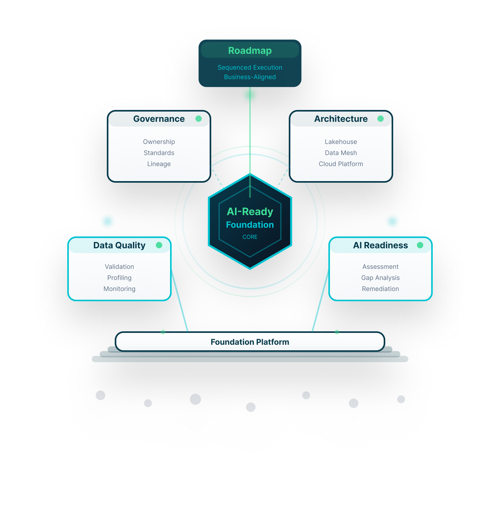
Trusted dashboards need governed metrics, ownership, access controls, and clear business definitions.

DataTheta is an enterprise Data, Analytics, and AI consulting company that helps organizations build AI-ready data foundations through Data Engineering, Data Science, Business Intelligence, Data Warehousing, Generative AI, and On-Demand Experts.
© 2026 DataTheta
Enterprise AI & Analytics


